THANKS, SEAN.


filefront:
FINAL.
DRAFT2.
DRAFT1.
Google Warehouse Model of Elevator/Table.
CLICK HERE
VERSACE:

The void situated within Versace's space allows for optimal circulation and expresses the structural power implied by the entire form.


Images of the showroom for Versace's products, with monumental elements to emphasise her power. Light fragile components are used to contrast with this and further emphasise the notion of power.

Entrance to the cafe/ informal meeting area is contrapted to intimidate patrons, making Versace (the observer from above) feel godly/dominating amongst them. Reflective surfaces are used, like a strobe light, to make a person feel as though they are being followed by a second self - frightening them and forcing them to lose all sense of power.

The Platform towards Versace's Office, with the slanting walls overlooking employees and consumers walking towards her - illustrating the relationship between power and consumerism
JOBS:


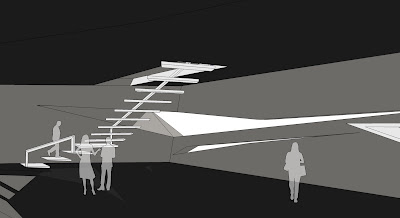
The curving walkway which guides people through Jobs' exhibition space - infusing the idea of manipulation into the building. It makes people feel as though an external force is pushing them through the building.

The monstrous walkway up to the exhibition space - veiling anything that would ruin the suspense provided by the space. This gives Jobs a sense of power as helpless consumers are unable to do anything about it.


Jobs' office is on the rim of the entire structure, acting as a balcony that looks over the whole of his complex. This makes Jobs feel as though he is the god of his microcosm.
MEETING:

The Split branches of the meeting space is used to lead Versace and Jobs to their own complexes. As they provide each persona with their own respective pathways, it gives them a sense of domination as they stomp through each one.

The central meeting space unifies elements of both clients' area and aesthetically balances the space.

Aditional notes on the table:
Smooth form provides a sense of unity betwen the clients. They are almost pulled right into it.
The table itself is short, forcing the clients to collaborate ideas and work together on the same plane rather than being seperated.
EXTERIOR:


